The world of Grand Theft Auto has become increasingly popular with every new iteration of the game racking up bigger profits and breaking records. The game that started as a humble attempt to offer full autonomy over the character and its surroundings in a free-roaming world has become a worldwide phenomenon. However, the game has gone through various stages of development. This is also true of the marketing and logos in particular. Here in this article we take a look at all the logos throughout Grand Theft Auto history and tie them in with the evolution of the game.
The First Grand Theft Auto Logo
©
The first Grand Theft Auto is to many modern gamers a mystery. While it was a massive success for the studio with over a million units sold within the first year, most gamers of today haven’t played it. They perhaps only know it from screenshots. However, the logo of the game is iconic. The whimsical font adorned with flames is still a sight to behold. It captures perfectly the tongue-in-cheek mentality of the game that has been criticized for its adult content.
Another important aspect of the very first logo is the stars surrounding the text. These are in the latter titles connected to the Wanted system, which is one of the core mechanics of the franchise. It has been in the series since the very first game, although incidentally Wanted levels are represented by police icons.
The logo is most often seen with colors but there’s also a black and white version of it.
Second Iteration of the Logo
While the first logo is indeed legendary and beloved by many. DMA Design, the developer of the first two Grand Theft Auto games, took a totally different direction with the new logo. The company opted for a much more muted design, which was a far cry from the fun-loving flames and color gradients of the initial logo.
©
While the Grand Theft Auto 2 logo is fairly distinct from both the logo of the first game and modern GTA logos, it is definitely a transitionary work. In terms of the typeface, it is somewhere between the modern logo and the first one. It is certainly closer to the modern ones with a much more subdued font and colors. It also has the rounded-up look of the modern logos, which has continued to this day. This Grand Theft Auto 2 logo essentially looks like a retro-style version of the modern logos.
Modern Logos
The game made huge advances in its third iteration. Most importantly, Grand Theft Auto III was the first 3D title in the series. However, it also revamped almost every other aspect of the game, too. This includes promotional material outside the game, like box art and logos. The logos that we now associate with Grand Theft Auto were designed specifically for GTA III.
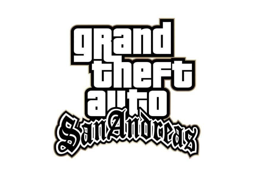
Now it features just a simple, black-and-white typeface with thick outerlines. The font is, however, a little bit more playful than the very business-forward look of the GTA 2 logo. This iteration of the logo has been in use for over 20 years now, since 2001. The weight of the font, the thickness of the lines, and other details might have changed. However, the logo has largely been consistent.
©
©
©
©
©
©
©
©
©
©
©
©
There are tons of different versions of this modern logo. Each game and expansion features it with a distinction on the bottom right or below the logo. Rockstar has used various colors to distinguish the games, expansions, and special editions from each other.
This includes the classic red color that has been several iterations of the game, the golden outlines for San Andreas and the Definitive Editions, and, the most recognizable of them all, the green Roman numeral for the Grand Theft Auto V. Additionally, Vice City and Vice City Stories share the same pink outline, The Ballad of Gay Tony has the colorful neon light look, The Lost and Damned has blood splattering on the logo, and so on.
In addition, there’s also a wide version of the logo, which has the same typeface and similar other properties.
©
Conclusion
There are not many logos that are more recognizable in gaming than the Grand Theft Auto ones. The game series is now more than 25 years old and throughout its history, it has delivered memorable art within the game and outside of it. As the release of the next-generation GTA title is closing in, we’ll have to see and find out whether the current GTA logo holds strong or whether Rockstar is going to revamp the logo after over 20 years of reign.