In 1996, Game Freak’s Pokémon Green and Pokémon Red debuted in Japan. Nintendo released both variations of the game for the current (at the time) handheld console, the Game Boy. These games led to a massive franchise that fans know and love. Pokémon took the world by storm. Nintendo launched the first of many successful video games across numerous Nintendo consoles, but it didn’t stop there. A popular Pokémon trading card game (TCG) also debuted in 1996. One year later, the original Pokémon anime aired in 1997.
Since Pokémon Green and Red, the franchise has reached stardom that few other franchises will ever manage. With a mixture of primary games, side games, and spin-off games, the Pokémon catalog includes over 120 games in total. It’s essential to keep in mind that many of these games are no longer in production, and therefore not available for purchase or play. There’s no denying that The Pokémon Company has dominated family-friendly gaming since the ’90s. To this day, Pokémon charms trainers and casual gamers around the world.
With well over 1,000 Pokémon now recorded in the Pokédex, it’s hard to argue that the most recognizable of them all is Pikachu. As one of the original starters and the first Pokémon given to Ash Ketchum in the anime series, Pikachu has become the mascot of the franchise. Pikachu’s design has shifted a little over the years, but the electric mouse is so iconic, that everyone knows it. Perhaps the only thing that has stayed more consistent than Pikachu is the Pokémon logo itself.
The Pokémon Logo Hasn’t Changed Much Over the Years
©en: Game Freak, en: Nintendo, en: The Pokémon Company, Public domain, via Wikimedia Commons
In modern times, long-standing franchises tend to go through rebranding the longer they stick around. Many gaming franchises that have seen the length of success that Pokémon has are no exception. Other franchises that debuted in the 1990s, like Silent Hill, Resident Evil, Tomb Raider, and Final Fantasy have all gone through major rebrands and turning points. Each of these gaming franchises has gone on to massive success and produced many games that are still going on today. Some of them eventually broke out into movie and television adaptations that expanded the franchises even further. None of them have managed to hold onto the same branding that The Pokémon Company has managed, though.
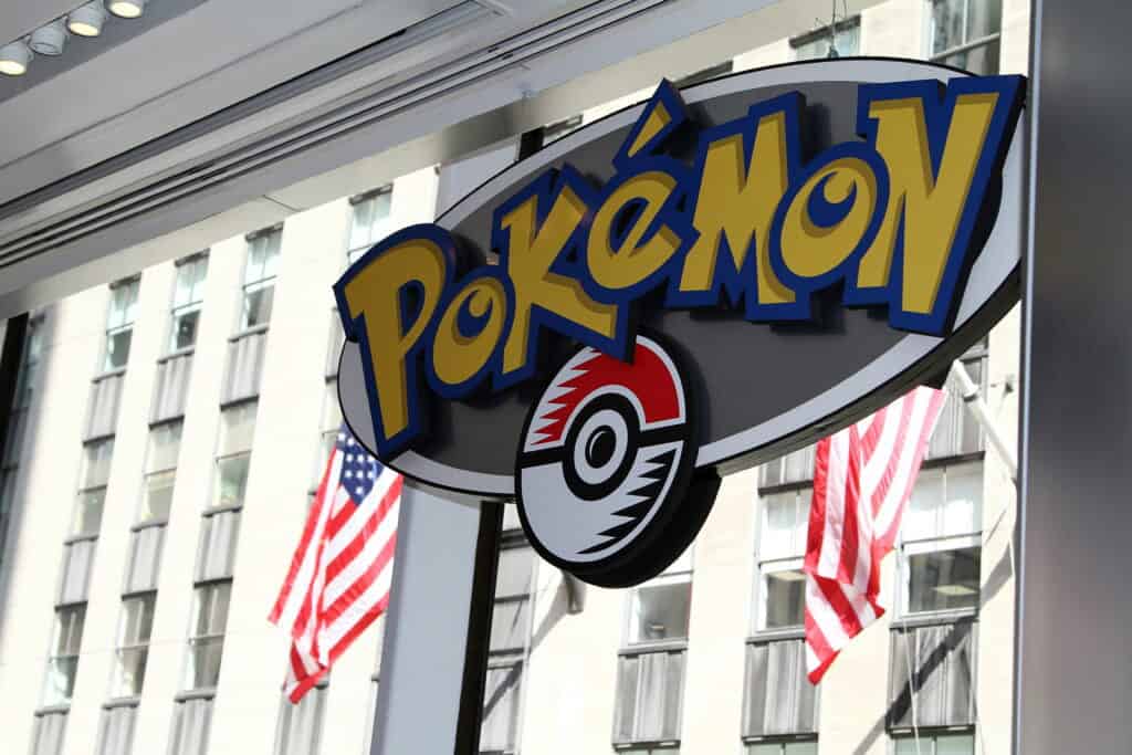
Unlike Silent Hill and Tomb Raider, which have both undergone various adaptations of their franchises and updated their logos to signify a new game or new chapter, Pokémon has never done that. In fact, aside from very small variations over the years, the English version of the Pokémon logo has stayed the same since it was first created in 1998.
The Pokémon logo features bright yellow block letters trimmed in a contrasting blue color. Although the Pokémon logo has been translated into many different languages, almost every single language features the same style of logo. The only logo that varies in style is the Japanese logo. The Japanese logo features a similar block style, but it changes colors and orientation for every release. Despite Pokémon originating in Japan, the English logo has become far more recognizable as a cultural staple. Thanks to its unmoving and unchanging appearance, it’s not only easy to spot, but it’s one of the most famous logos in the world.
Before the Pokémon logo existed, there were a few other stabs at creating a logo for the Pokémon franchise. This included the original 1990 logo that said “Capsule Monsters.” In 1994, the logo was shifted to a giant “PM” which included an early image of a dragon-like Pokémon between the letters. Beneath the image, the full words “Pocket Monsters” sat, explaining what the logo was meant to represent. Neither of these early logos actually stuck and, eventually, the Pokémon name and logo were introduced to the world.
The original 1998 Pokémon logo was slightly different. The first iteration of the logo featured a lighter yellow font. The yellow was lighter towards the bottom of the letters and formed a gradient upward into a darker yellow. The letters still featured the same iconic block shape and were still outlined in darker blue. This original logo also featured heavier shadows behind the Pokémon name. Later that same year, Game Freak updated the Pokémon logo to the bright yellow-rimmed-blue aesthetic that fans have come to know and love.
Why Hasn’t the Pokémon Logo Changed?
©Jim, the Photographer / CC BY 2.0. – License
It’s somewhat abnormal for logos to never change. Aspects of a 30-year-old franchise will shift to modernize in order to keep up with the times. Game Freak, the video game developer behind Pokémon, intentionally leaves the logo as is. The unchanging imagery sparks nostalgia in long-term fans. Each Pokémon game is different and updates to give players a more immersive experience. That said, the core gameplay is always the same.
Every Pokémon game features similar mechanics that involve capturing and training Pokémon. The Pokémon aren’t good or evil, they just exist in the world alongside humans. Some thrive in the wild, while others have been domesticated and trained. Pokémon aren’t all that different from the concept of having pets, though pet parents don’t normally have their pets battle. All of the main games focus on the player’s journey as a trainer. Fundamentally, almost every game is the same at its core. Rather than think of each game as an individual story, it’s more like another game in a sports championship.
In an interview with Pokémon.com, Shigeru Ohmori, the director of the Pokémon games, explained that, “One of the things I always put a lot of focus on is the feeling of growing alongside your Pokémon throughout the adventure. I think that’s pretty core to the series.”
During that same interview, Junichi Masuda, The Pokémon Company’s “Chief Creative Fellow,” also had some valuable input on what a Pokémon game should be. “The wild Pokémon start out as— They’re sort of like enemies, but you can catch them, and they become your friends,” Masuda said. “So, we want to make sure that the Pokémon never come across as too evil. They’re not just bad guys—they can also be your friend. Having that kind of relationship, I think, is key to the series.”
The general vibe of the Pokémon franchise, especially the games, feels like home. No two games are the same, but each game is reminiscent of the games that came before it. That familiarity shines in every aspect of the franchise, including the iconic, unchanging Pokémon logo.
The image featured at the top of this post is ©en: Game Freak, en: Nintendo, en: The Pokémon Company, Public domain, via Wikimedia Commons.